perjantai 25. syyskuuta 2015

Typografia tutkimusmatka osa 1

Groteskit

Groteskilla tarkoitetaan tasavahvaa tai lähes tasavahvaa kirjaintyyppiä, jossa ei ole päätteitä. Kirjainten keskiakselin kaltevuutta ei ole. Monien groteskikirjainten nimeen liitetään sana gothicSans serif ja sans tarkoittavat kaikkialla groteskia.


Kuvahaun tulos haulle logo

Kaunis logo & yksinkertainen teksti toimii.


Kuvahaun tulos haulle logo

Selkeä ja erottuva ilme.


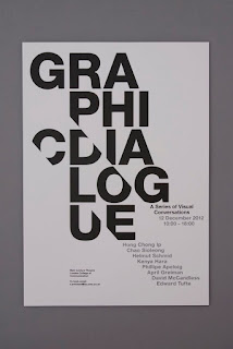
Kiinnostava idea & selkeä teksti.


The colors are perfect in this design, so unique and a great use of white space! After doing the map infographic, I'm realizing that I have a fear (okay, maybe fear is a little dramatic) of white space/unused space. White space can be the most effective part of a piece of work.:

Hauskat elementit, kirkkaat värit kiinnittävät huomion julisteeseen, otsikko nousee selkeästi esiin. Särmikkäät reunat, värien käyttö ja dynaaminen otsikkoteksti.


I like the 'n' in white. It's a creative way to show the word.:
Näyttävä, keskitetty teksti toimii. Samalla yksinkertainen ja kikkaileva.


colours of the rainbow:
Pirteät värit, hauskat fonttien kokoerot.


As word bubbles with tiny tails-love the colors, would add a bright? Love the font too. Tegan Smith Creative Communications:
Vaihtelevat värit tuovat hauskuutta.


Brain Storm by Rich Hensman  Design a Better Tomorrow. http://www.nevernorth.com #webdesign, #freelancer, #graphic design:
Tumma tausta toimii.


woordlogo welke goed toegepast kan worden op hotspot, kleuren zou ik vervangen door magenta / fuchsia en cyaan / aquablauw:
Eriväriset kirjaimet tuovat mielenkiintoa. Pirteät värit.


Logo Inspiration | #1204:
Simppeli & toimiva!


Ei kommentteja:

Lähetä kommentti